

When the Lights Go Out, Satellites Are Watching
When the Lights Go Out, Satellites Are Watching

Dark Light Viewer is a new free open source tool that lets anyone track how cities, conflict zones, developments and communities change at night over time.
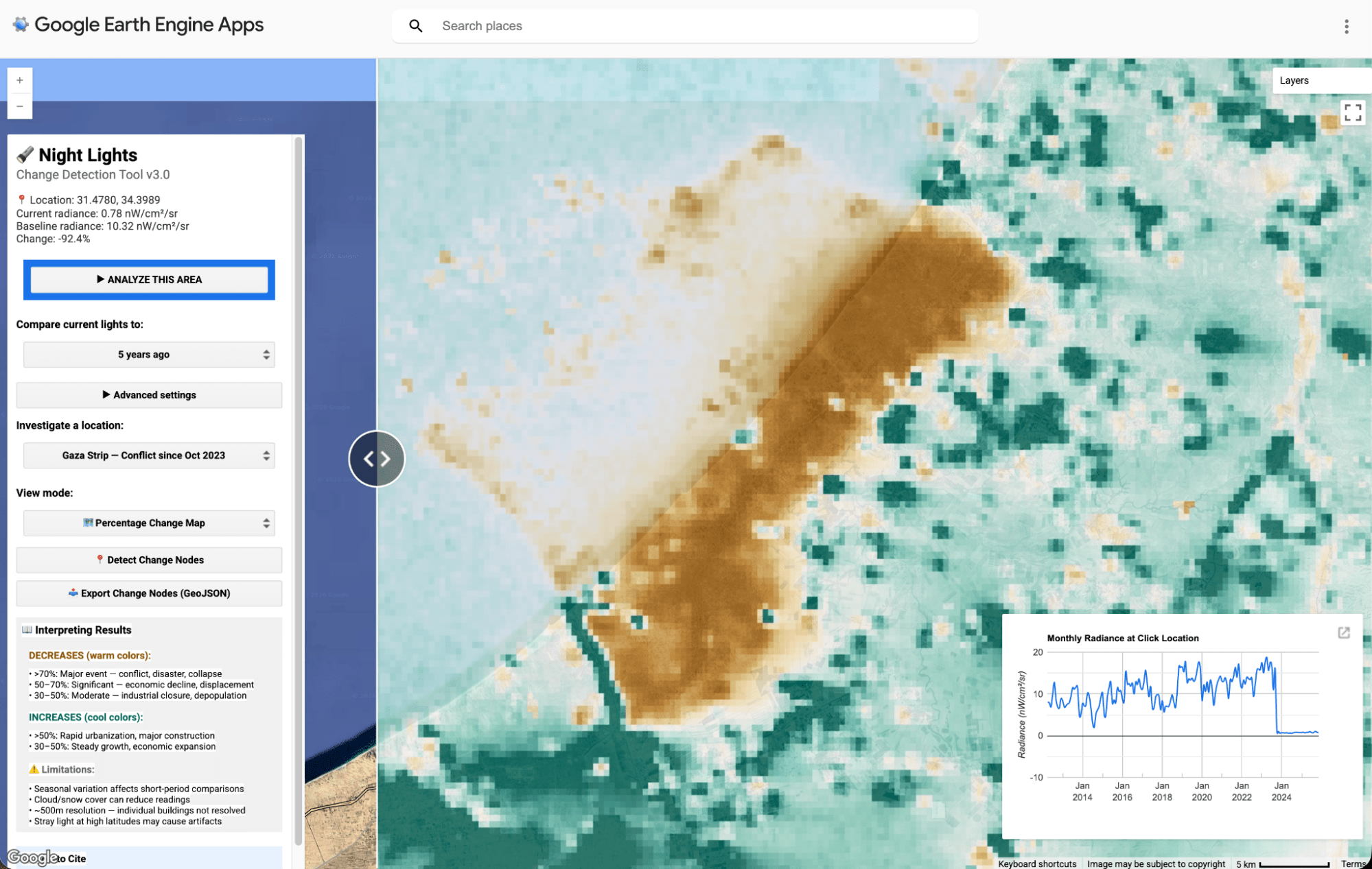
On 7 October 2023, the Gaza Strip still showed up from space as a thin, familiar band of electric light along the Mediterranean.
By early January 2024, much of that glow had gone.
84% of Gaza’s nighttime light had vanished.
Whether you interpret that change as grid damage, fuel scarcity, displacement, curfews, or some mixture of all of the above, the point is darkness is measurable.
Measuring it is done with a sensor called VIIRS (Visible Infrared Imaging Radiometer Suite). It images the entire planet nightly and has done so since 2012. The data it produces is free, public, and extraordinarily revealing.
It can show you which parts of a city lost power after a hurricane, which towns went dark when a war began, which new cities were built but never actually inhabited.
The Dark Light Viewer generates a single change-detection layer by comparing the most recent VIIRS capture (typically from today or yesterday) against an earlier point in time that you choose. By default, you can pick a window looking back one month, one year, five years, or ten years. If you need something more specific, the advanced settings let you set a custom date range.
Why is this tool useful? While tools like NASA Worldview let you browse nighttime imagery side by side, the Dark Light Viewer goes further: it automatically calculates exactly how much light has changed, pixel by pixel, and presents that as a single colour-coded change detection layer.
Rather than squinting at two images and trying to judge the difference visually, you see the change directly, which areas lost 30% of their light, which lost 80%, and which have grown.
That quantified, spatial view of change is what makes it useful for investigations and reseach rather than just observation.
What can you actually use it for?
The tool is built around one question: has the light in a specific location changed over a set time period, and by how much? The answer is useful across a surprisingly wide range of fields.
Humanitarian monitoring: A town that loses 60% of its light in two weeks signals mass evacuation or infrastructure collapse, often before any ground-level report exists. Useful for NGOs and aid coordinators operating in restricted-access zones.
Investigative journalism and OSINT: If a government says a city is functioning normally but nighttime light has dropped 70%, that gap is a story. Useful for reporters verifying claims in areas they cannot physically reach.
Economic and development research: Track post-disaster economic recovery, measure whether aid investment is producing visible activity, or cross-check official GDP figures in countries where government statistics are unreliable.
Real estate and urban development: See where cities are genuinely growing versus where new development sits empty. Track the spread of new residential zones, commercial districts, or the slow dimming of towns in economic decline. Useful for property analysts and urban planners.
Industrial activity and energy monitoring: Factories, ports, and mining operations leave distinct light signatures. Track the opening of new extraction sites, the expansion of industrial zones, or the shutdown of facilities — activity that is often commercially sensitive and not publicly reported.
Disaster response and recovery: Map the power loss footprint of a hurricane or earthquake within days, then track how quickly light returns as a proxy for recovery. Areas that remain dark months later are likely still in need of significant intervention.
Environmental and conservation monitoring: New light appearing in previously dark areas can flag illegal development in protected zones, unplanned mining, or fishing activity in restricted waters. Also useful for tracking light pollution creep into conservation areas over time.
Academic and student research: Access real-world global data with no coding required. Geography, economics, and international relations students can build original research questions directly from the satellite record.
What is nighttime light data, and why does it matter?
The basic idea is simple: at night, where there are people, there is usually light. Factories, homes, roads, shops, almost all human economic activity produces some kind of illumination that is visible from space.
Scientists have known for decades that you can use this glow to measure things that are otherwise very hard to measure. For example, researchers have found correlations between night lights and GDP measurements. This insight was formalised by economists Henderson, Storeygard, and Weil in a landmark 2012 paper in the American Economic Review, showing that satellite light data could independently measure economic growth in countries where official statistics were unreliable.
Xi Chen and William Nordhaus at Yale subsequently demonstrated that luminosity data could substitute for economic statistics in countries without reliable censuses. The World Bank launched its ‘Light Every Night’ initiative, a 250-terabyte open archive of every nighttime satellite image captured since 1992, and began using the data to monitor everything from COVID-19 economic impacts to infrastructure investment returns.
For conflict and humanitarian work, the applications are even more direct. When a city loses power, whether because of bombing, an infrastructure collapse, or an economic crisis, it goes dark. That darkness is visible from space, and it can be tracked night by night over days, weeks, months and years.
The tool that makes this data most useful is VIIRS, which currently flies on three satellites: Suomi NPP, NOAA-20, and NOAA-21. Unlike earlier satellite sensors, VIIRS captures precise measurements of light intensity at a resolution of roughly 750 metres. It can distinguish between a village and a highway. It does not wash out in bright city centres. And it covers the entire globe every single night.
All of that data is hosted, for free, on Google Earth Engine, a cloud computing platform for satellite data analysis.
How the Dark Light Viewer works
The Dark Light Viewer is built on top of Google Earth Engine but removes the need for any coding.
You open it in a browser, navigate to a location on the map, choose a time period for comparison, anything from one month to ten years, and click Analyse. The tool does the rest.
What you get is a split-screen map. On the right side, the nighttime satellite image from your chosen starting period. On the left, the Google Maps hybrid satellite view.

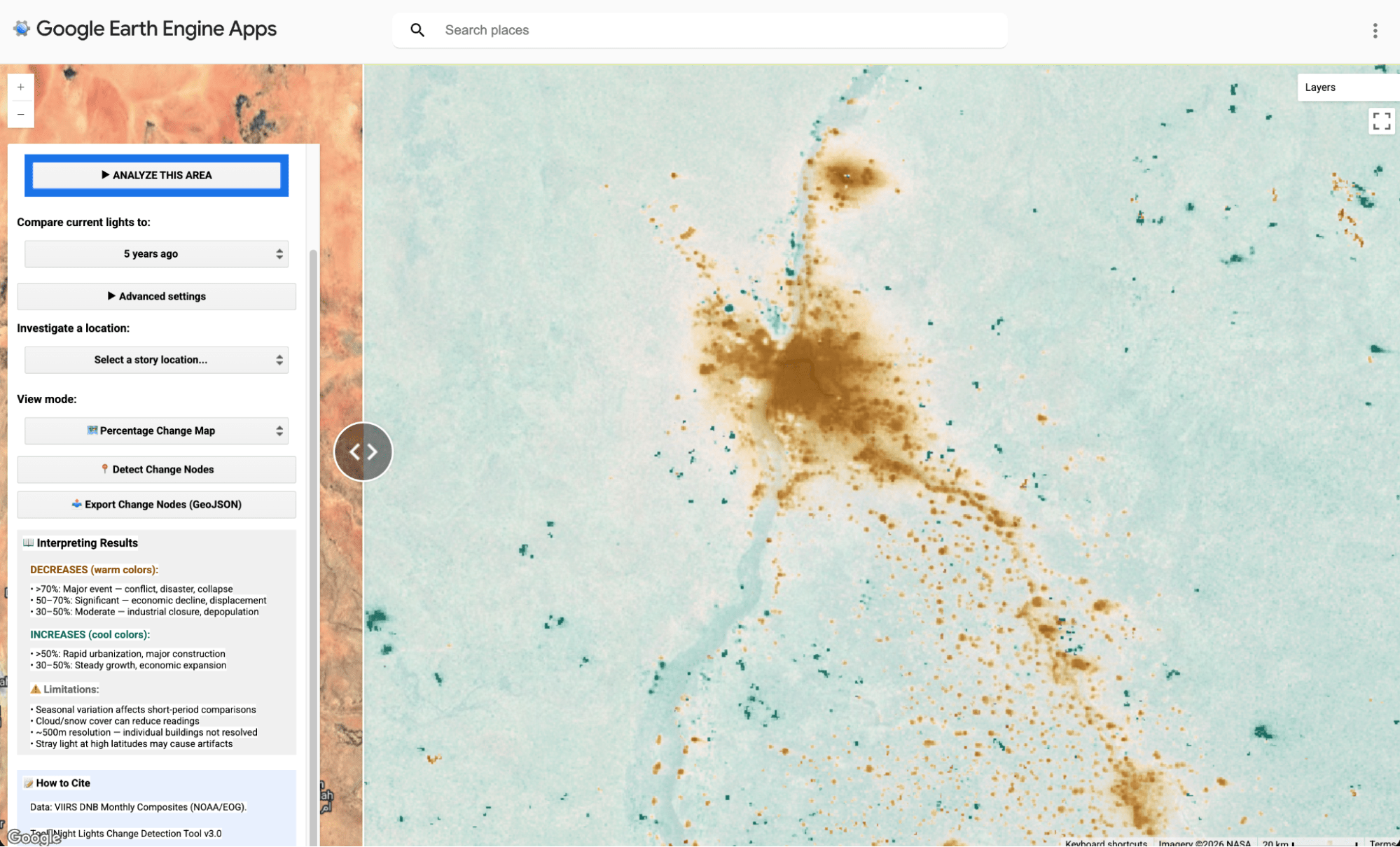
A colour-coded change layer highlights exactly where light has increased or decreased, and by how much.
Warm colours indicate a severe loss of light (typically between 30-70% reduction). THe green/cool colours marks areas of growth.

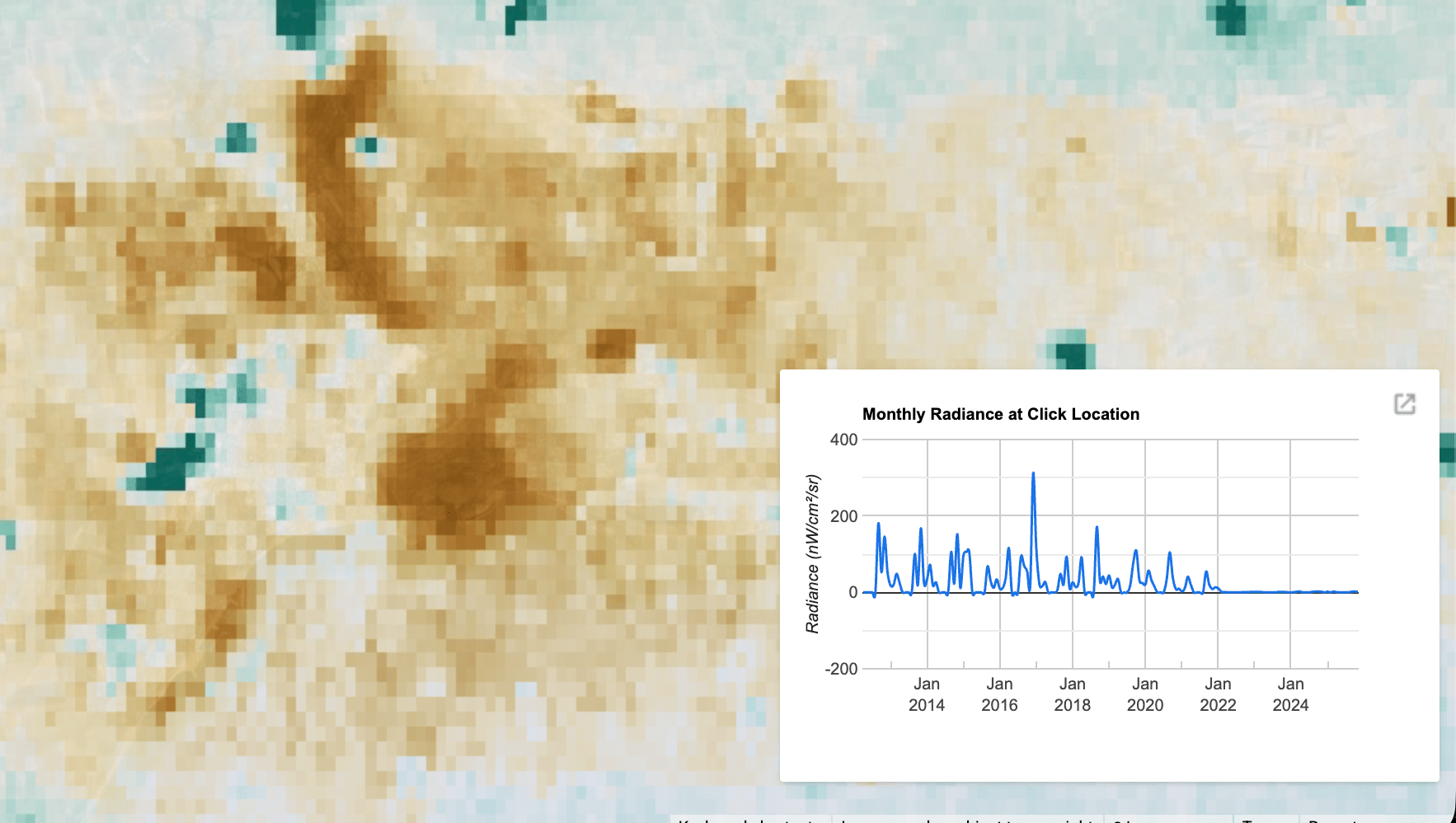
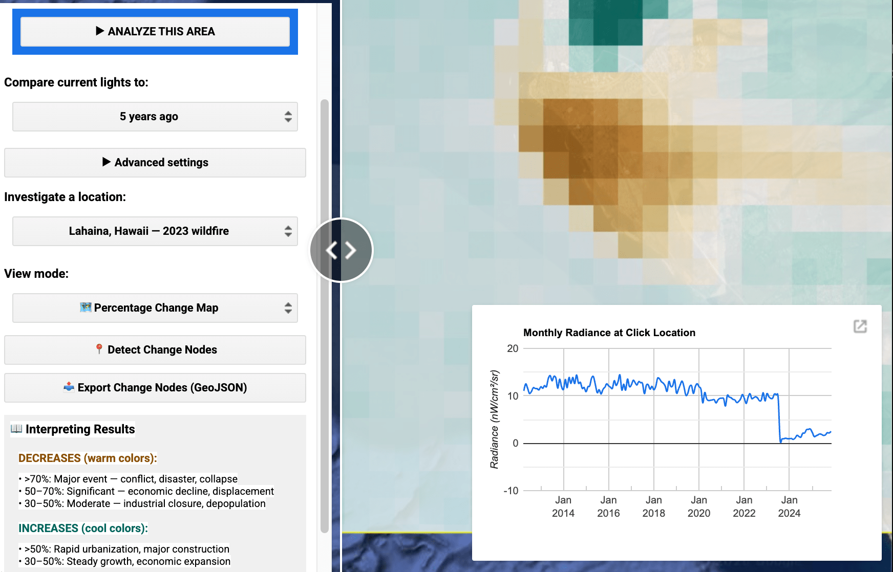
Click anywhere on the map and the tool generates a chart showing how light levels at that exact spot have changed across the entire VIIRS record, monthly, back to 2012.
This is the feature that separates a gradual economic decline from a sudden collapse, or a seasonal fluctuation from a genuine crisis.

The tool also has a library of pre-loaded locations so that new users can immediately explore examples before investigating anywhere they choose.
It runs within Google Earth Engine’s free tier, meaning it costs nothing to use and nothing to host. (Hooray for open source).
What the data reveals: four cases from around the world
The following are five case studies that show the relevance of using the Dark Light Viewer tool in your workflow to identify or monitor activity. Always remember that this is just one signal in an ecosystem of information, and findings should always be cross-referenced with other data and reporting before making any conclusions.
CASE STUDY 1: GAZA
The satellite record of Gaza after October 2023 is one of the most dramatic documented in the history of nighttime light analysis. Gaza City lost 91% of its nighttime illumination within months. Rafah, where over a million displaced people had fled, lost 70%. Approximately 70% of hospitals showed little or no nighttime light by March 2024.

These figures were calculated by Dr Xi Li of Wuhan University, commissioned by CARE International, and published in a peer-reviewed journal in early 2025. The World Bank independently corroborated the findings using its own satellite analysis pipeline. Both reached essentially the same conclusion: the territory’s power infrastructure had been almost entirely destroyed.
The satellite data mattered here because ground access for independent reporting and monitoring was severely restricted. The nighttime light record provided something that field journalism could not: a comprehensive, objective, and continuously updated picture of infrastructure collapse across the entire territory, updated every single night.
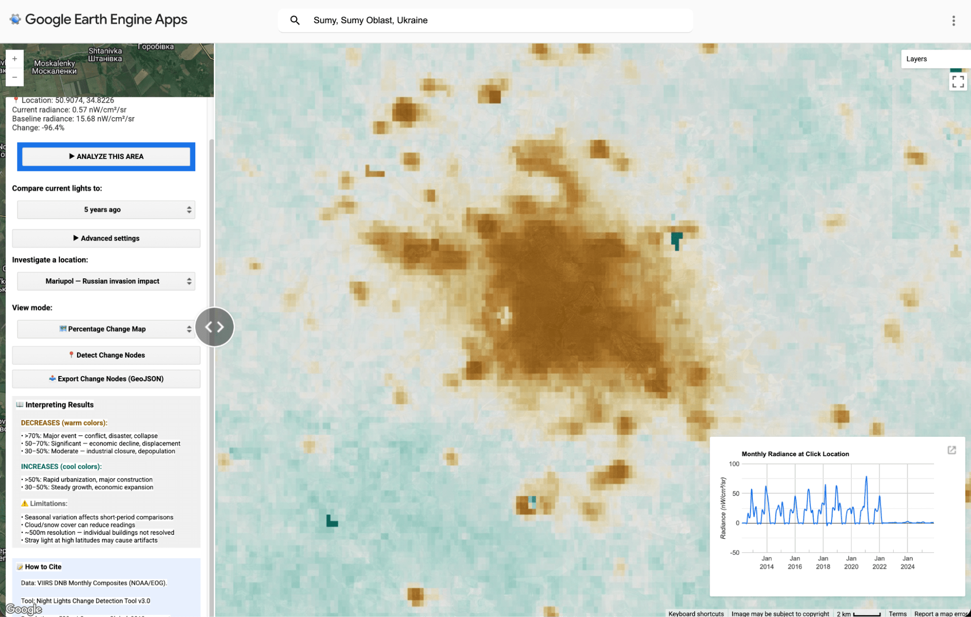
CASE STUDY 2: UKRAINE
When Russia invaded Ukraine in February 2022, the change was detectable from orbit almost immediately. NASA’s Earth Observatory tracked Kyiv’s transformation from a ‘spidery web of light’ to near-total darkness.
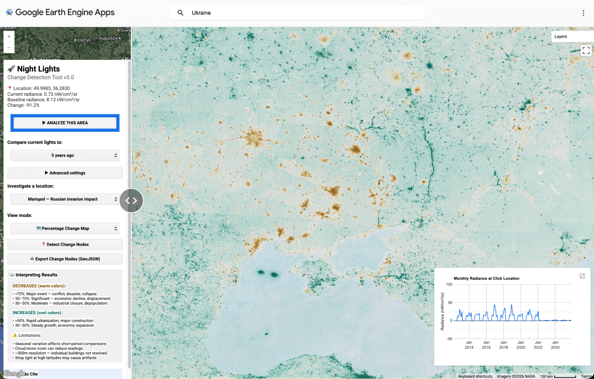
The city of Sumy saw its nighttime light drop by approximately 86% within days of the invasion beginning.
As the war progressed into winter 2022 and 2023, Russia began systematically targeting Ukraine’s power grid with missile and drone strikes. The Payne Institute at Colorado School of Mines produced daily raster maps tracking the darkening across the country, developing a dedicated ‘Dimming Lights Ratio’ methodology.
Their analysis also revealed something unexpected: the 40-mile Russian military convoy near Kyiv in the early days of the invasion was visible as an anomalous new light source, evidence of poor light discipline that inadvertently exposed the convoy’s position.
The case of Ukraine is also an important reminder to check the story before jumping to conclusions. While it might look like power sources and lights were shut off from power stations being targeted, it has also been the case that turning off lights was encouraged for ‘light camouflage’ purposes.
CASE STUDY 3: THE NETHERLANDS – LUTTELGEEST
The greenhouse clusters of Flevoland province are a distinctive feature of Dutch VIIRS data, isolated glowing rectangles in otherwise dark polder farmland, visible from orbit. The Luttelgeest area alone hosts over 200 hectares of horticultural operations growing peppers, tomatoes, and flowers under high-pressure sodium lamps that burn 16 or more hours daily through the winter months.
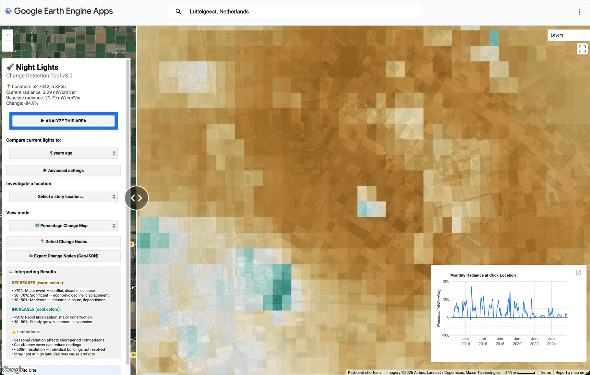
Between 2014 and 2023, the Netherlands recorded a 37% decline in nighttime light, one of the sharpest drops recorded for any stable, prosperous country in the VIIRS era.
The cause was not conflict, economic collapse, or depopulation. It was energy prices. Russia’s invasion of Ukraine sent European gas prices to historic highs, and Dutch growers, facing bills that threatened to bankrupt entire operations, shut lamps down, ran reduced hours, or accelerated a long-planned switch to LED grow lighting. LEDs shift light emission toward shorter wavelengths that VIIRS partially misses, causing the sensor to undercount LED-lit areas by roughly a third compared to equivalent HPS installations.
The Luttelgeest case is the sharpest available demonstration of why the tool’s output always requires context. The change detection layer will show significant dimming across these zones.
The country’s economy and agricultural output are fine. The lights changed in a way the sensor cannot distinguish from a crisis, because a sensor cannot know why lights go off, only that they did.
CASE STUDY 4: THAI/MYANMAR BORDER AFTER MYANMAR FIGHTING
After Myanmar’s 2021 coup, the Thai–Myanmar border became a pressure valve. Fighting, conscription risk, and economic collapse pushed people towards Thailand in waves, sometimes into established camps, sometimes into temporary “safety areas”, and often into informal housing around border towns and crossings. 
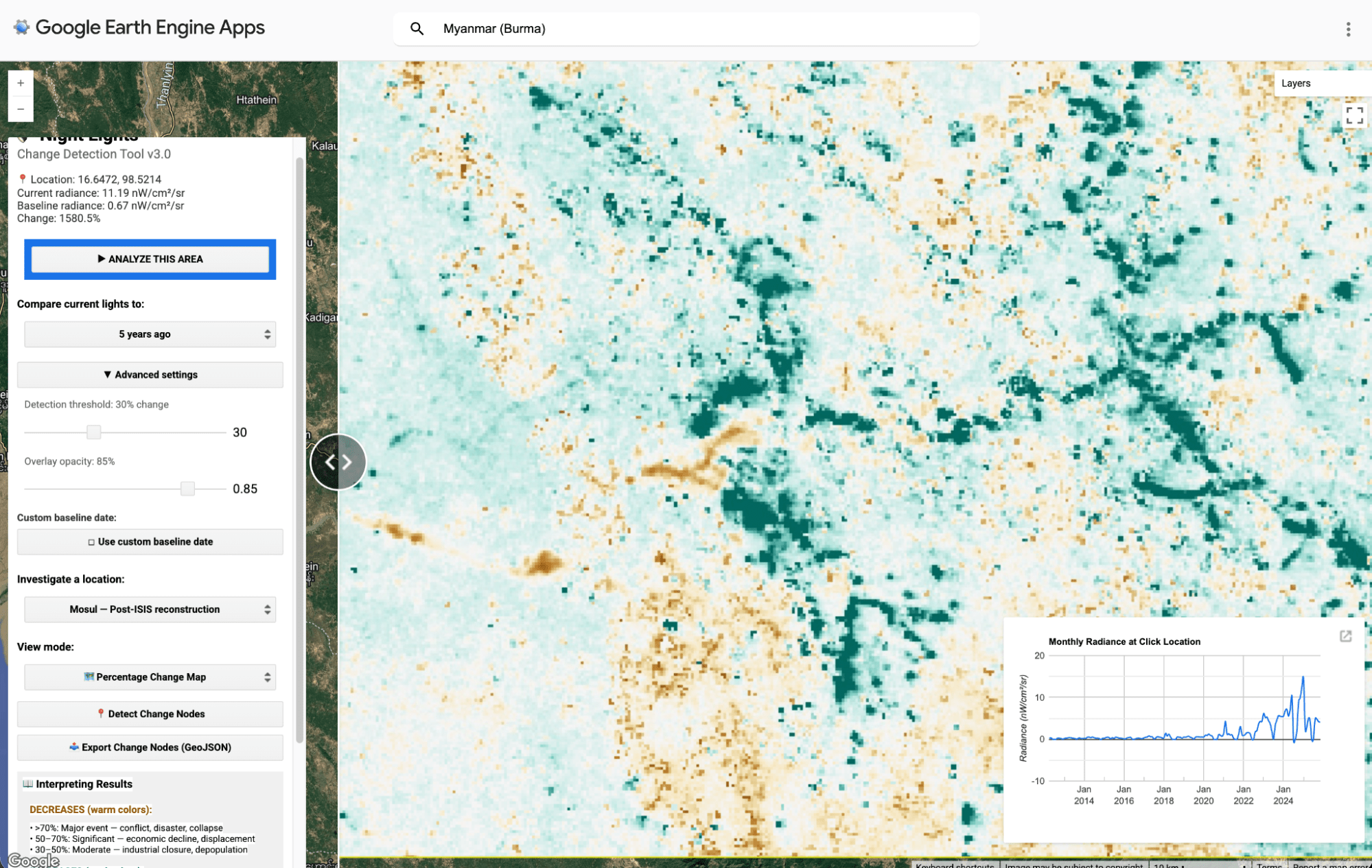
A practical place to start is Tak Province on the Thai side: the Mae Sot area, the road network running north and south along the border, and known refugee-hosting districts like Umphang. UNHCR reporting in 2024 notes the creation of a new temporary safety area (TSA) in Umphang district to host refugees fleeing fighting — a reminder that displacement here isn’t just historic, it’s ongoing and operationally managed in real time.

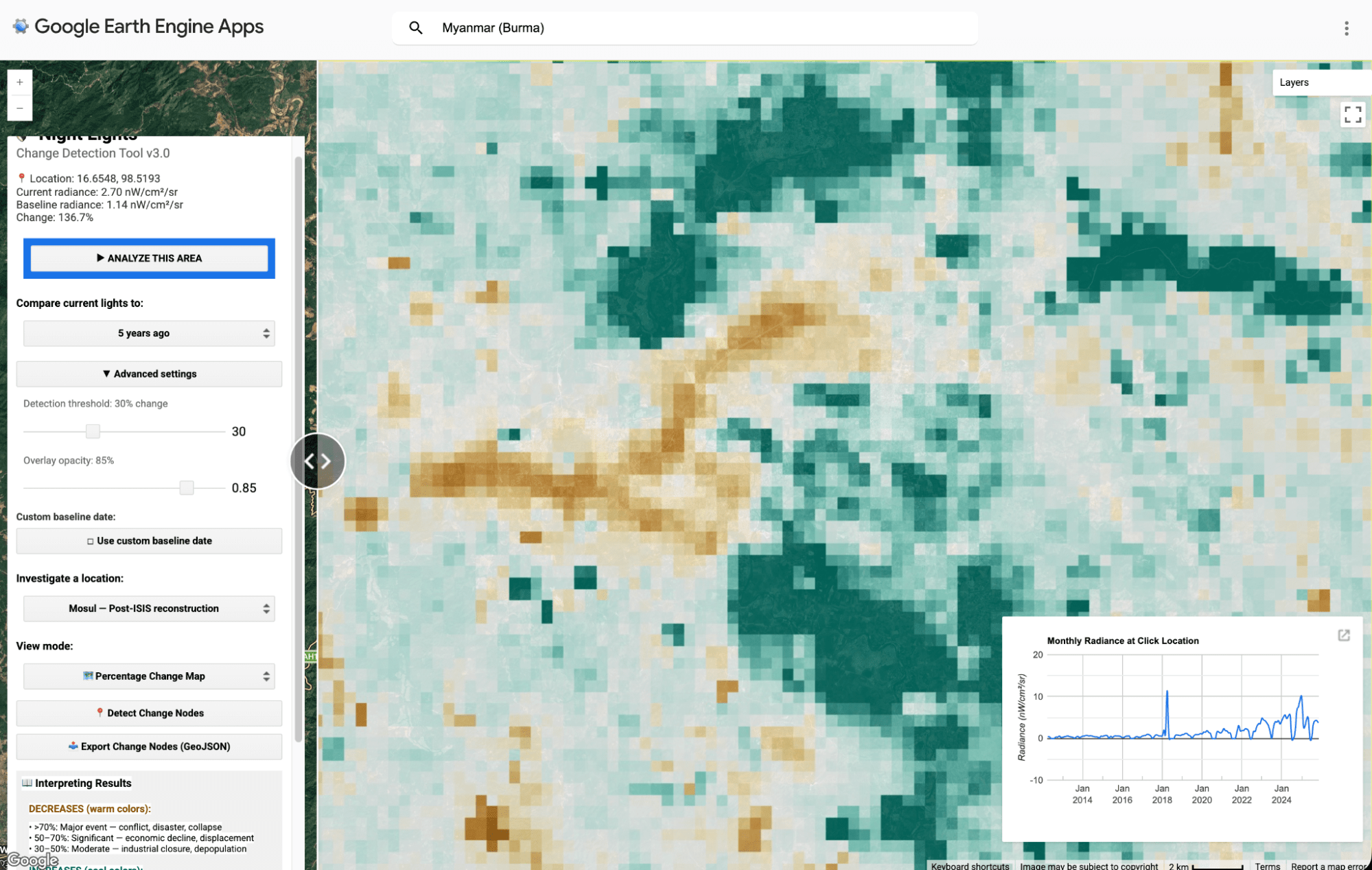
At the same time, the long-standing border camps have also grown again. The Border Consortium has reported a significant increase in populations in the nine Thailand–Myanmar border camps since the coup, which provides useful ground-truth context for any upward shift you see in light signatures around these areas.
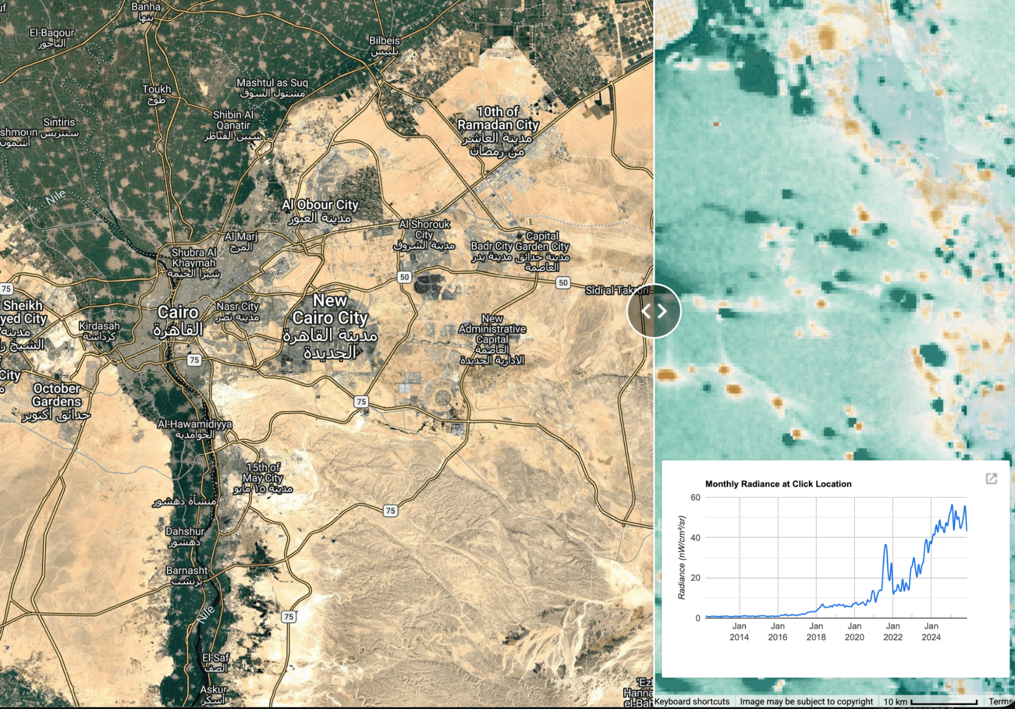
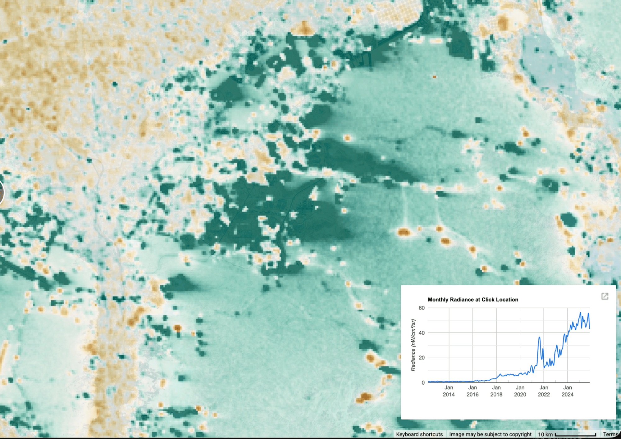
CASE STUDY 5: EGYPT’S NEW ADMINISTRATIVE CAPITAL
Forty-five kilometres east of Cairo, the VIIRS record tells the story of a city being switched on. The site was announced in 2015 registered as essentially dark in 2017. From 2020, light began appearing and growing steadily, tracking the acceleration of construction as Egyptian military-linked contractors and China State Construction Engineering Corporation’s Central Business District team pushed toward completion. By 2024, when the government formally inaugurated the capital as its seat of power, the satellite signature had reached its peak: a distinct, structured cluster of light where desert had been.
NASA Earth Observatory documented the physical transformation using Landsat imagery — barren sand in August 2017, a built urban grid by August 2024, including Africa’s tallest building and a military headquarters compound described by Egyptian authorities as the world’s largest. The VIIRS record adds something Landsat cannot: the timeline. You can watch the light arrive gradually, district by district, year by year, before any official announcement marked the city as complete.
What the satellite cannot resolve is who is actually there. As of March 2024, more than 1,500 families had relocated to a city designed for six million. The light pattern reflects this: bright infrastructure, road grids, government compound floodlighting, the illuminated bulk of the business district — without the diffuse residential glow that signals a population actually living there. Whether that changes will be visible in the satellite record long before any official figures confirm it.
Reading the data honestly: what the tool can and cannot tell you
Satellite nighttime light data is powerful, but it has real limitations that any user should understand.
The most common problem is cloud cover. The VIIRS sensor cannot see through clouds, so in consistently cloudy regions, much of the tropics, or northern Europe in winter, monthly satellite composites may have significant gaps. Comparing imagery from two seasons with very different cloud cover can produce misleading results.
Fires and gas flares register as bright light sources and can be mistaken for urban illumination. Regions with active agricultural burning, offshore oil platforms, or volcanic activity will show light changes that have nothing to do with human settlement or infrastructure.
Polar regions present their own problem: during summer months, the sun does not fully set at high latitudes, which prevents the sensor from detecting artificial light at all. The tool includes a warning for locations above 65 degrees latitude.
Perhaps most importantly, percentage changes need context. A 2025 academic study found that nearly a quarter of the world’s population lives in areas with no detectable nighttime light at all, meaning the tool is inherently less useful for monitoring the poorest and most rural communities. A 50% reduction in nighttime light means something very different in a densely lit European city than in a dimly lit rural area.
The Dark Light Viewer should be treated as one input among several, not as definitive proof of any particular ground condition. It is exceptionally good at telling you that something has changed. Determining exactly why requires additional research, reporting, and judgment.
Who should use this, and how
For journalists and investigators, the Dark Light Viewer offers a fast way to check whether satellite data supports or contradicts a story. The New York Times, BBC, CNN, and Reuters have all published major visual investigations using this kind of analysis.
For researchers and academics, the tool provides a quick visualisation layer for exploratory analysis, hypothesis generation, and classroom demonstration. Bellingcat’s open Remote Sensing for OSINT curriculum is a useful companion resource for those wanting to go deeper.
For NGOs and humanitarian organisations, the precedent is already established. CARE International, UNOSAT, and the World Bank all use nighttime light analysis operationally. The UNDP has used nighttime light patterns to map gang-controlled areas in Port-au-Prince, Haiti, where direct access is impossible.
For students and the general public, the pre-loaded locations are a good starting point. But also venture further, and use it to monitor recent events, changes and developments.
Watching a city recover its light after an earthquake, or tracking a region’s gradual economic decline over a decade, transforms news into something you can see and measure for yourself.
[/fusion_text][/fusion_builder_column][/fusion_builder_row][/fusion_builder_container]